View Incentives Campaign performance
How-to | Last updated: 1/28/2026 | Learn how to view Incentives Campaign performance
To see how your Incentives Campaigns are performing, you can view measurement data in the Report Center.
View report
-
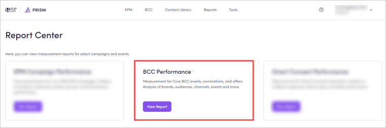
From 84.51° Prism, click Reports.
-
Click View Report on the BCC Best Customer Communications Performance card.
When the report loads, you'll see an overall Performance Summary.
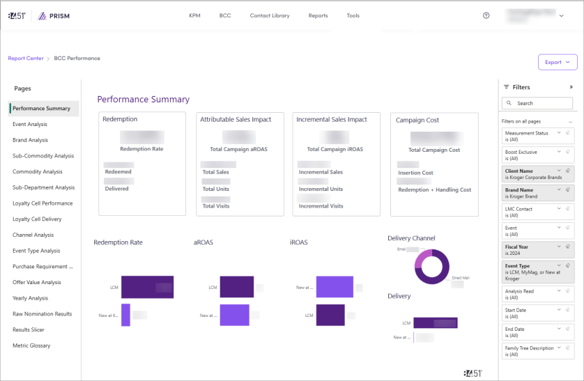
Data is updated at Weeks 0, 2, and 6 for Loyal Customer Mailer Reward and retain current buyers with hyper-relevant offers served via a combination of direct mail and digital channels. (LCM Loyal Customer Mailer)s and Weeks 0, 2, 6, and 13 for MyMagazine Reward current buyers and acquire relevant category-buying households with personalized offers and equity advertising served via combination of direct mail and digital channels. and New at Kroger Introduces new items to Kroger customers with offers targeting category-relevant householdss with highest propensity for trial..
You can use this data to plan and optimize your next event.
Watch this video to get an overview of BCC Campaign performance.
Customize report
To customize your view, you can apply one (1) or more filters like Brand Name, Client Name, Event, Event Type, Fiscal Year, Start Date, and End Date.
You can also use keywords in the search bar to customize your reports.
You can navigate between pages to view specific data.
|
Page |
Description |
Instructions |
|---|---|---|
|
Performance Summary |
Shows overall performance of your brand's investment in Incentives. |
|
|
Event Analysis |
Shows performance for each event where you placed a nomination. |
|
|
Brand Analysis |
Shows a breakdown of how your nominations performed by brand. |
|
|
Sub-Commodity Analysis |
Shows data on how sub-commodities performed. |
|
|
Commodity Analysis |
Shows data on how commodities performed. |
|
|
Sub-Department Analysis |
Shows how your nominations performed by sub-department. |
|
|
Loyalty Cell Performance |
Shows how your nominations performed by each event's loyalty cells. |
|
|
Loyalty Cell Delivery |
Shows how your nominations performed by each event's loyalty cells delivery. |
|
|
Channel Analysis |
Shows data on how channels (Direct Mail (DM) or Email (EM)) performed. |
|
|
Event Type Analysis |
Shows how your nominations performed by event type. |
|
|
Purchase Requirement Analysis |
Shows how your nomination performed based on the purchase requirement entered in the coupon, if applicable. |
|
|
Offer Value Analysis |
Shows how your nomination performed based on coupon offer value, if applicable. |
|
|
Yearly Analysis |
Shows how your nominations perform year over year. |
|
|
Raw Nomination Results |
Shows the raw data for your nominations. |
|
|
Results Slicer |
Shows all results for all nominations in one place. |
|
|
Metric Glossary |
Shows definitions of all metrics used in BCC reports. |
Click Metric Glossary to access this page. To learn more about each metric, see Metrics. |
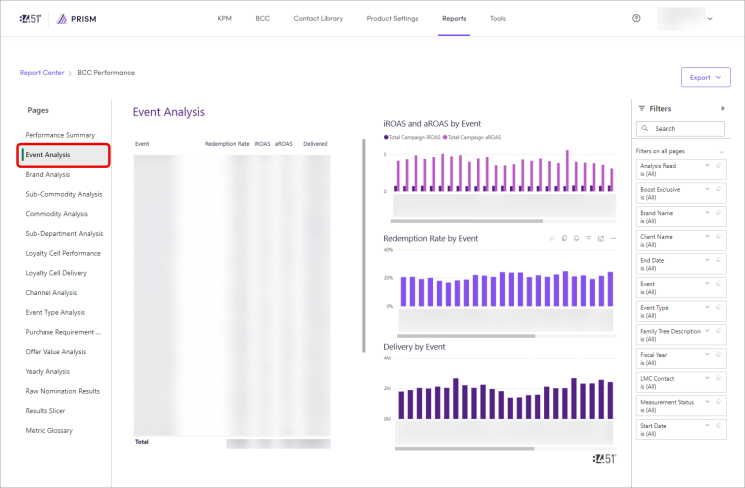
View event data
If you want to only see data for a specific event, navigate to Event Analysis.
-
Click Event Analysis.
-
In the first column, find the event for the data you want to see.
-
Click on the event to highlight its data in the other data tables and charts.
-
(Optional) Apply one (1) or more filters to further separate the data.
Visualize data
Within the report, you have a few options to visualize your data.
|
Option |
Instructions |
|---|---|
|
Focus mode |
Click Focus Mode ( |
|
Show as Table |
Click the ellipsis ( |
|
Spotlight |
Click the ellipsis ( ), then Spotlight to visually highlight that specific data table or chart. ), then Spotlight to visually highlight that specific data table or chart. |
|
Get insights |
Click the ellipsis ( |
|
Sort by |
Click the ellipsis (
|
 ) to expand a data table or chart.
Export data
Export specific data
-
From the specific chart or visual, click the ellipsis (
 ), then Export Data.
 -
Export your data in the format that suits your needs.
If you have a lot of data, the number of rows you export might be limited depending on the file type you select.
Export all data
-
Click Export.
-
Use the dropdown to select either Export as .pptx (PowerPoint) or Export as .pdf (PDF).
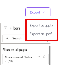
Your final download includes one (1) page for each tab of your report, including visuals and filters, but not any raw data used to create the charts and tables.
Metrics
Each page of the report contains various metrics.
|
Metric |
Definition |
Calculation |
|---|---|---|
|
Allocated |
The total households within your circulation The number of households where the coupon is sent. that were select to receive the offer prior to any email suppression. |
— |
|
Analysis Read |
The most updated results that are available for the campaign, described by the number of post-period weeks measured. Loyal Customer Mailer
MyMagazine and New at Kroger
|
— |
|
aROAS |
Attributable Return on Ad Spend; the total sales of the targeted test group (for the products being measured) relative to the Total Cost. |
Total Sales / Total Cost |
|
Campaign Cost |
The total cost of the campaign, including distribution cost, coupon redemption cost, and coupon processing, and handling fees. |
— |
|
Delivered |
The households that successfully received the communication aka Circulation. |
Total Sales / Total Spend |
|
Incremental Sales |
The increase in total sales of redemption products by test households, above and beyond what would have been expected when compared to control households. |
Test Sales − Control Sales |
|
Incremental Units |
The increase in total units of redemption products purchased by test households, above and beyond what would have been expected when compared to control households. |
Test Units − Control Units |
|
Incremental Visits |
The increase in the total number of baskets containing at least one redemption product by test households, above and beyond what would have been expected when compared to control households. |
Test Visits − Control Visits |
|
iROAS |
Incremental Return on Ad Spend; the total sales difference between test and control relative to the Total Cost as determined by the total Sales Uplift generated by households targeted for the coupon. |
(Total Test Group Sales - Expected Sums the total expected value from plan groups, aggregated based on the view or report in which it appears. Includes everything but Boost.ac Sales)/ Total Cost |
|
Loyalty Cell |
|
— |
|
Redemption Rate |
The percentage of households that redeemed the offer. |
Redeemed / Delivered |
Cross-Channel Campaign report
If you're running a Cross-Channel Campaign, you may qualify for PrecisionView 360 measurement.
To learn more, see Cross-Channel Campaign reporting.
Related topics
Want to learn more about this topic? See these related topics:
Learn more
Explore other sections in the Learning Center to learn more about 84.51° Prism: